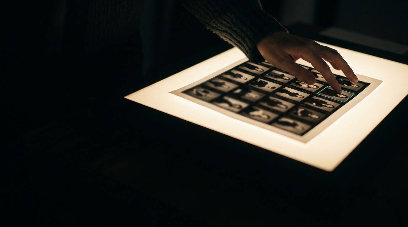
Photography has always been a discipline in conversation with its medium. The constraints of the plate camera shaped the formality of Victorian portraiture. The portability of 35mm unlocked street photography. The instant feedback loop of digital sensors changed the way photographers think about exposure and risk on set. What is less often acknowledged is that the screen — the primary destination for almost all photography made today — has introduced its own set of compositional demands. The frame is not neutral. It is asking something of you, and the photographers who understand what that is consistently produce images that stop the scroll.
The principles that follow are not an attempt to replace the classical literature on composition. They are, rather, a translation exercise — an effort to take what working editorial photographers understand about how images function in digital contexts and make it legible to anyone who makes images for a living. Some of this will confirm what you already do intuitively. Some of it will ask you to reframe habits that were perfectly correct for print and are quietly working against you online.
Six Principles from Working Editorial Photographers
These observations have been drawn from conversations with editorial photographers working across fashion, portraiture, architecture, and documentary practice — practitioners who regularly produce work for digital-first publications and direct-to-client platforms, and who have developed, through trial and iteration, a set of working principles for the screen.
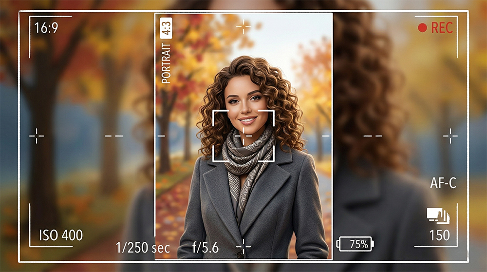
The Digital Frame as Editorial Brief
There is a useful way to think about the requirements of the digital frame that borrows from print editorial practice. Every publication — print or digital — has a set of implicit constraints that constitute an editorial brief. The column width, the paper stock, the binding style, the relationship between image and text: these are not merely logistical facts about the publication. They are visual instructions to the photographer, shaping what will and will not work in that context.
The screen is not a neutral container for a photograph. It is an editorial context with its own demands — and the photographers who treat it as such are the ones producing work that performs.
— GlamBon Culture EditorialThe digital frame is, in this sense, the most specific editorial brief a photographer has ever been asked to respond to. It is backlit, it is interactive, it is surrounded by competing content, it is viewed at varying sizes on varying devices, and it is consumed in a state of partial attention. The photographers who produce work that consistently functions in this context have not abandoned compositional rigour. They have extended it to account for conditions that the classical literature on composition had no occasion to address.
The practical implication of this is straightforward: before the shutter fires, the destination matters. Not as a constraint that compromises the image, but as a contextual fact that informs every compositional decision — from focal length to framing to the quantity of tonal information in the midground. The best editorial photographers working today are not unaware of this. They are quietly fluent in it.
Composition in Practice: Try It
The following interactive demonstrates how subject placement and compositional framing interact with the digital viewport. Use the controls to position the subject and observe how the relationship between the subject and the frame edge changes the perceived energy of the image.
Explore how subject placement changes the mood and energy of the composition
Questions on Composition
Intentional negative space is often the most overlooked and most powerful tool. Digital screens — especially mobile — reward images that have room to breathe, where the subject is clearly isolated against a considered background. The eye needs somewhere to rest before it knows where to look.
Print allows the eye time to travel. Social media is a scroll — an image has roughly 1.3 seconds to create a stop-moment. This means the compositional hierarchy must be immediately legible: one clear subject, one clear mood, minimal competing elements. The thumbnail test — does it read at 200 pixels wide — is a useful discipline even for full-resolution work.
For work that will be distributed digitally, yes. A 4:5 vertical frame fills a phone screen; a horizontal frame does not. Many editorial photographers now capture both orientations on set, particularly for hero shots, to retain flexibility across platforms and publications.
Colour is compositional in digital contexts in a way that print work can sometimes underplay. On a screen, a single saturated hue draws the eye before any structural element. Controlling the colour temperature of your frame — deciding what the dominant tone is and what it is competing with — is as important as deciding where to place the subject.